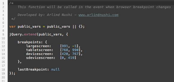
Main scripts instances of the theme are executed on assets/js/xenon-custom.js so if you want to learn more how they coded read the code. Its all commented to help you understand what does what.
Browser Intent – Responsive
For responsiveness, we have created xenon.resize event that is applied on $(window) and tells you when the window has been resized. This is special event because it fires only when the window has finished the resizing, not every pixel it has been resized. They you can use helper functions to detect the device type and they are:
- is(device_type);
- Example: is(‘largescreen’); or is(‘tabletscreen’); or is(‘devicescreen’); or is(‘sdevicescreen’);
- ismdxl(); // true when screen size is large screen or tablet screen
- isxs(); // true when screen is smaller than tablet
You can change the breakpoints or add custom on this file: assets/js/resizeable.js

