Everyone wants the work they show online to be uniquely represented. Using Kalium’s portfolio types and options can lead to fantastic unique portfolios with a few steps.
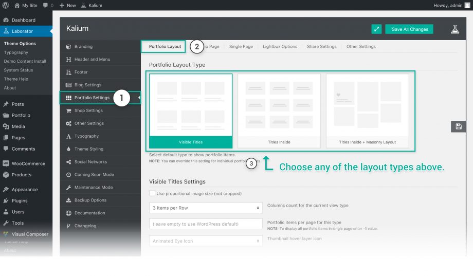
There are three main types you can set from the Theme Options Visible Titles, Titles Inside and Titles inside and Masonry. Each of these types has their own options which can extend to really a high number of portfolio types. Changing the portfolio layout here won’t affect the one you add via WPBakery Page Builder, also each portfolio page has the same settings in inside the Parameters and Options.
Let’s go and see how we can select any of these types:
- Go to Laborator > Theme Options in your admin dashboard.
- Select Portfolio Settings from the left sidebar of options.
- Make sure the Portfolio Layout is selected from the tabs above.

Visible Title Settings
These settings are only valid when the Visible Title layout is selected.
- Use proportional image size (not cropped) — Proportional image will be used in thumbnails and it won’t be hard cropped to the size set in the thumbnail size.
- Columns count for the current view type — Set in how many columns you want to show your work, there are up to 6 columns available in a row.
- Portfolio items per page for this type — The number of items you want to show per page if you want to show them all type -1
- Thumbnail hover layer icon — Choose the hovering icon of thumbnails, select between Static Eye, Animated Eye or select Custom Icon and choose your own brand logo or any other icon.
Titles Inside & Masonry Layout Settings
The following settings are only valid when the Titles Inside or the Masonry Layout Settings area selected.
- Show like button for portfolio items — Tick if you want to show the like button on hover.
- Columns count for the current view type — Set in how many columns you want to show your work, there are up to 6 columns available in a row.
- Spacing between portfolio items — Select between Default Spacing which you can set up below or select Merged, to show them sticking to each other.
- Default item spacing — If you have selected the Default Spacing option above, then set the item spacing in pixels, it will be applied to all portfolio items.
- Portfolio items per page for this type — The number of items you want to show per page if you want to show them all type -1
Thumbnail Options
|
|
|
|
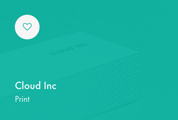
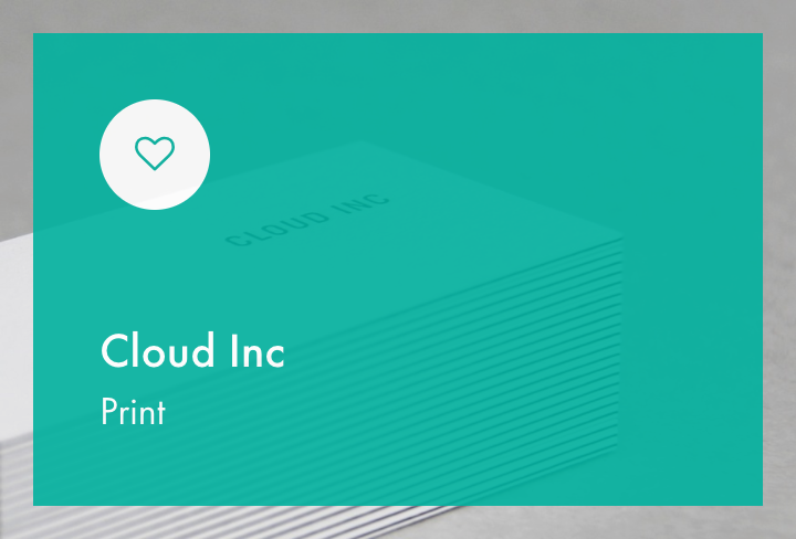
- Hover effect — Select the style when you mouseover the thumbnail, options are No hover effect, Full background hover and Distanced background hover.
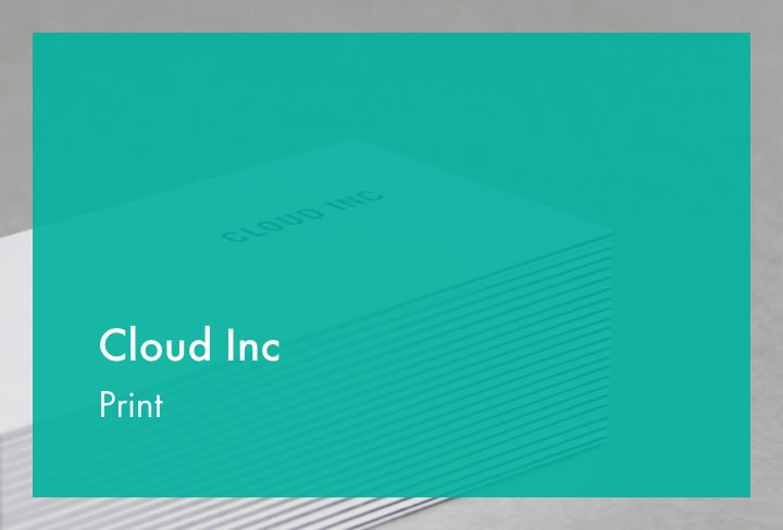
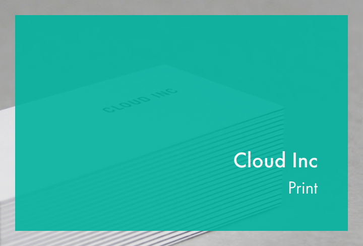
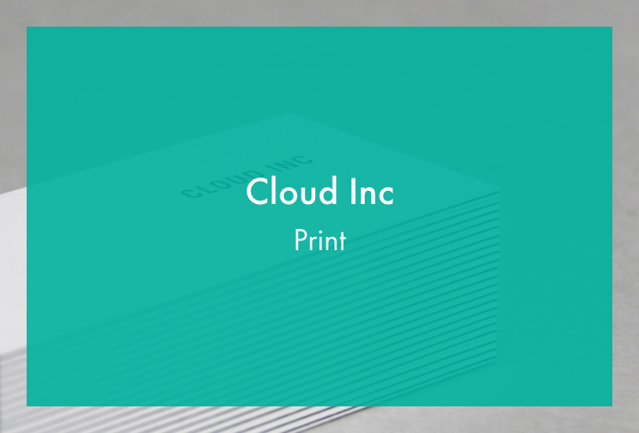
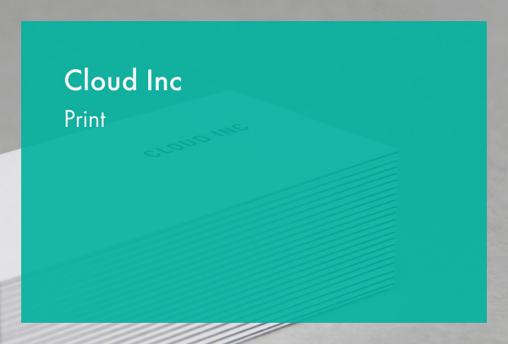
- Hover text position* — Select the are where you want to show the title of items, see examples below.
- Hover transparency — Apply a light transparency for the hover effect or leave it blank without transparency.
- Hover background style* — Choose between Primary theme color (the link color set in Theme Styling), Black Background or White Background or select a custom color below and set the transparency there.
- Hover color background for this type — Set the background color on mouseover for this portfolio type.
- Thumbnail size for this type — Set a custom size for your portfolio items and do not forget to Regenerate Thumbnails. Default thumbnail sizes such as full, large, medium, thumbnail are also supported.
* Parts marked with the asterisk are shown only when the Titles Inside & Masonry Layout Settings is selected.
Hover text position
|
|
|
|
|
|
|
Full-width Portfolio
- Extend portfolio container to the browser edge — Tick if you want to extend the portfolio to the browser edges.
- Include title and filter within container — Tick if you want to keep the Title and Filter within the container but the portfolio to be extended.

