
 If you want to use dividers on your pages, you can do that with the Dividers element on WPBakery Page Builder (formerly Visual Composer). We have added a lot of nice styles for the dividers and we will add more styles through the updates.
It is very easy to use this elements because the options that it offers are self explanatory and intuitive but we will describe those options on this article.
Add Divider element
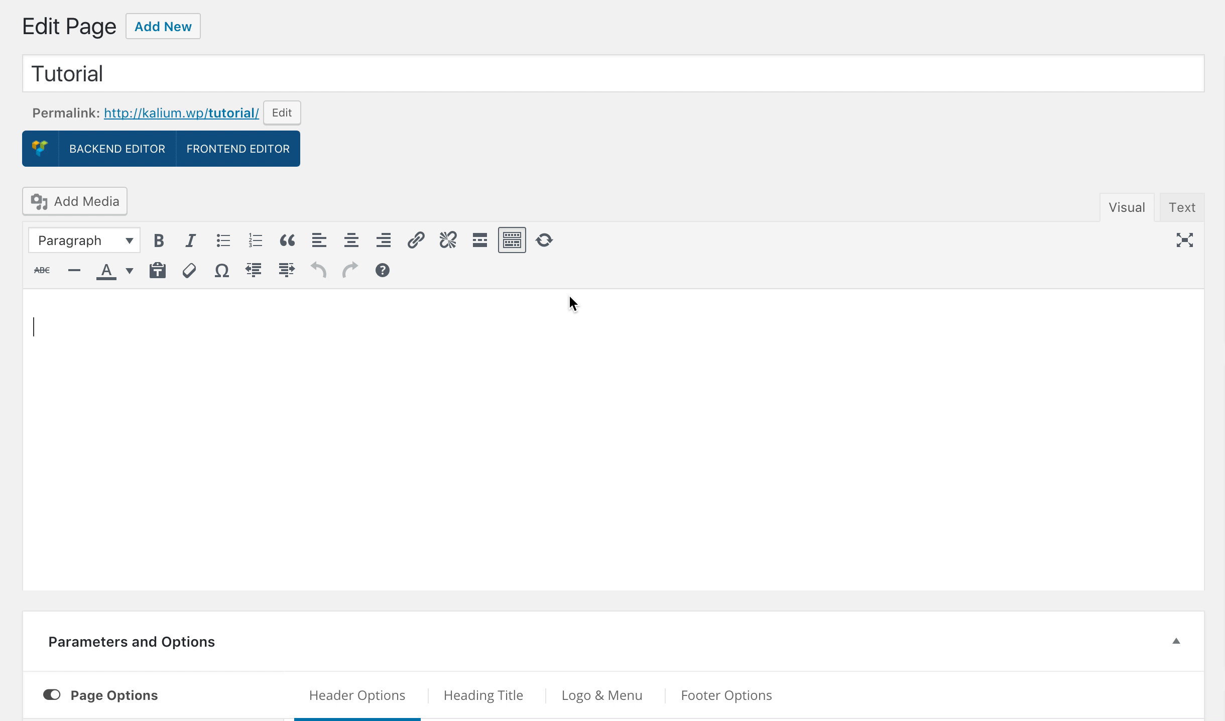
- Make sure that you have clicked Backend Editor button on the WPBakery Page Builder (formerly Visual Composer) area.
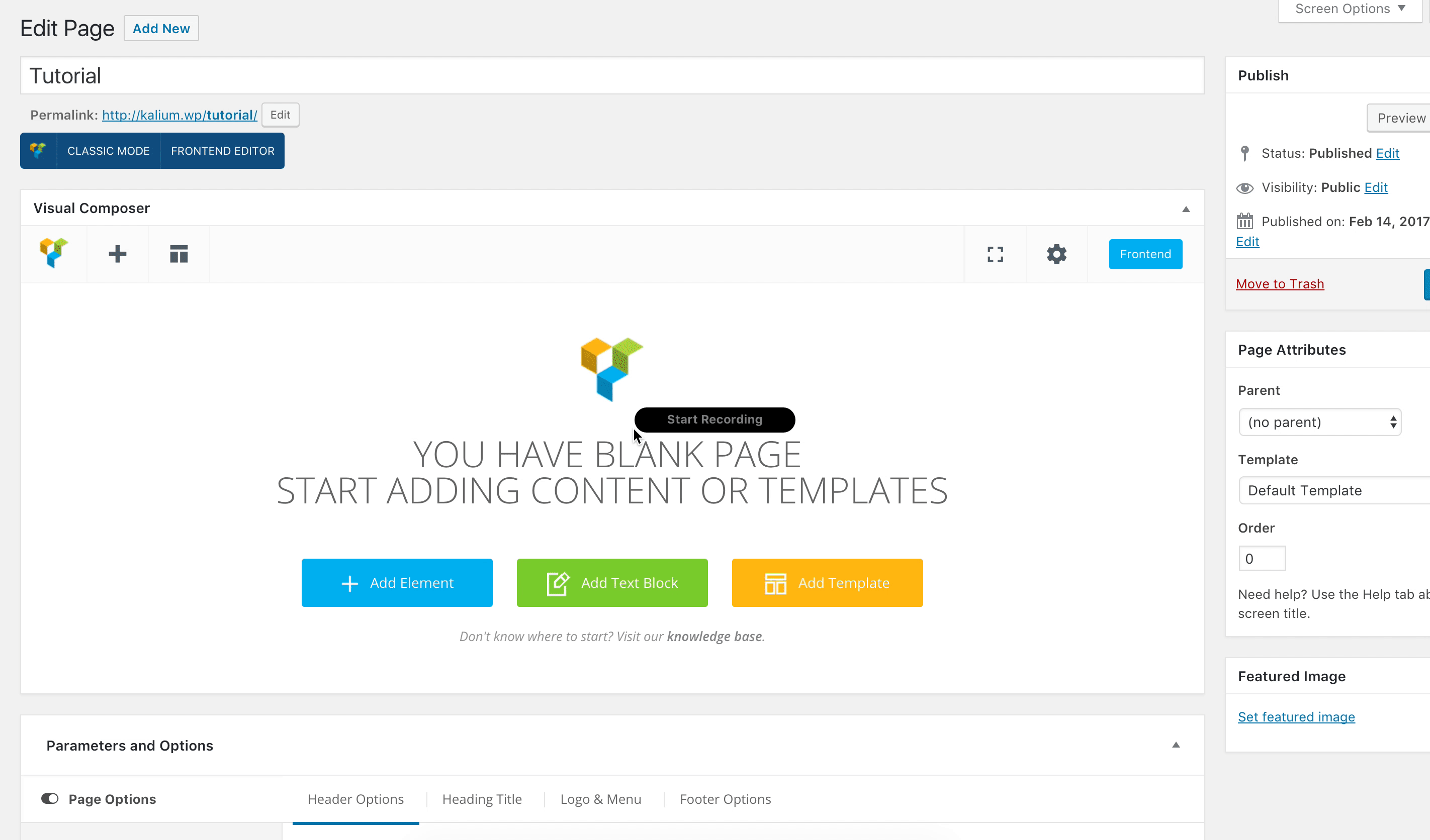
- Click on the Add Element button to continue.
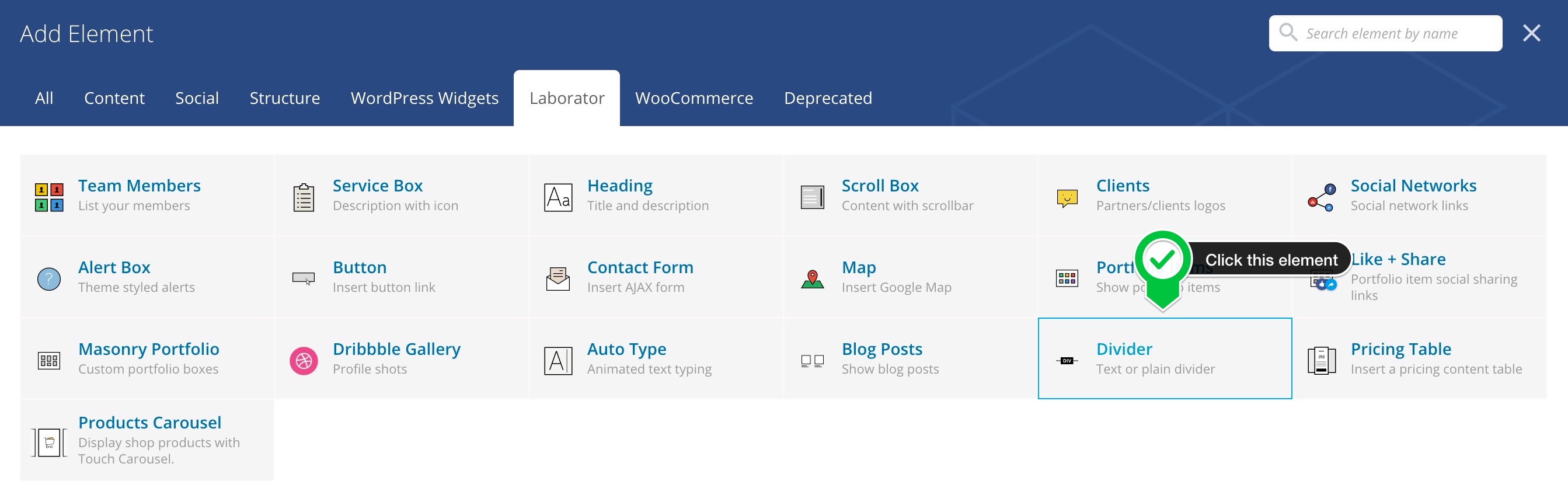
- Then when the Add Elements area appear just click the Laborator tab
- Choose Divider element.
- Divider Settings element will appear and the options to choose are those:
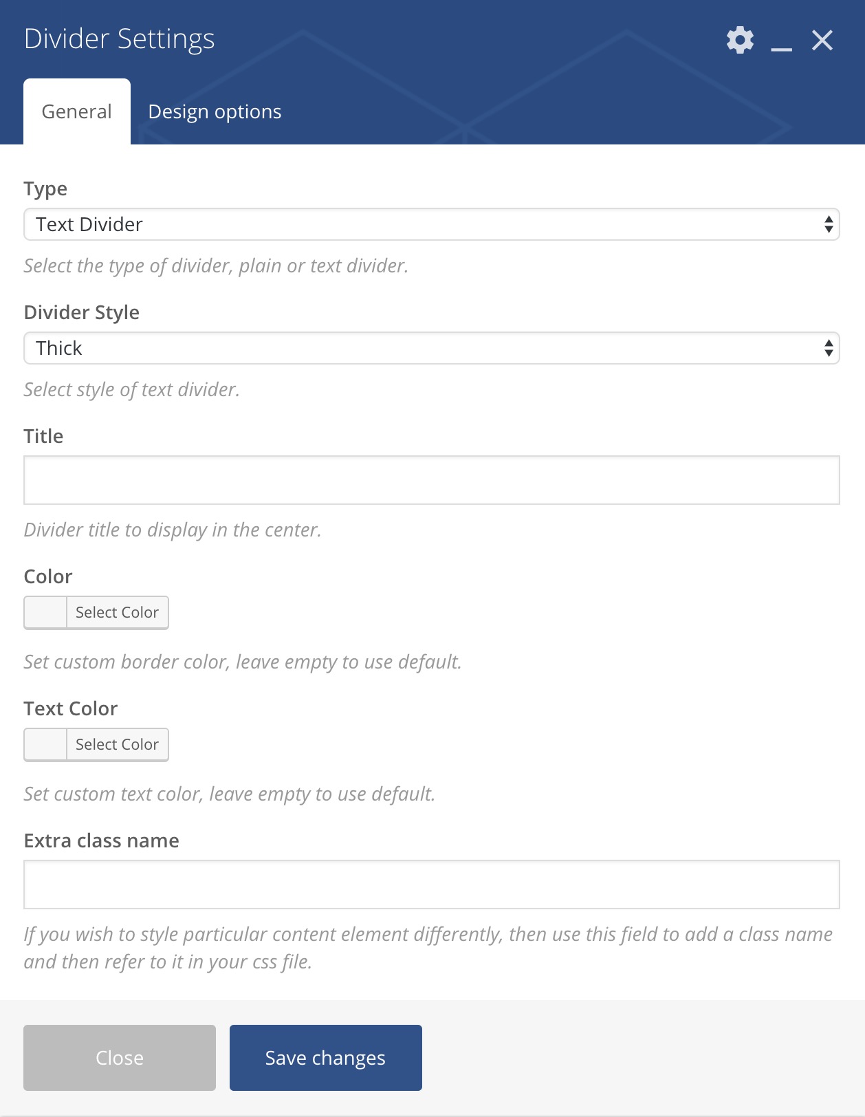
Divider Settings
- Type — Select the type of divider. Options are Plain or Text Divider.
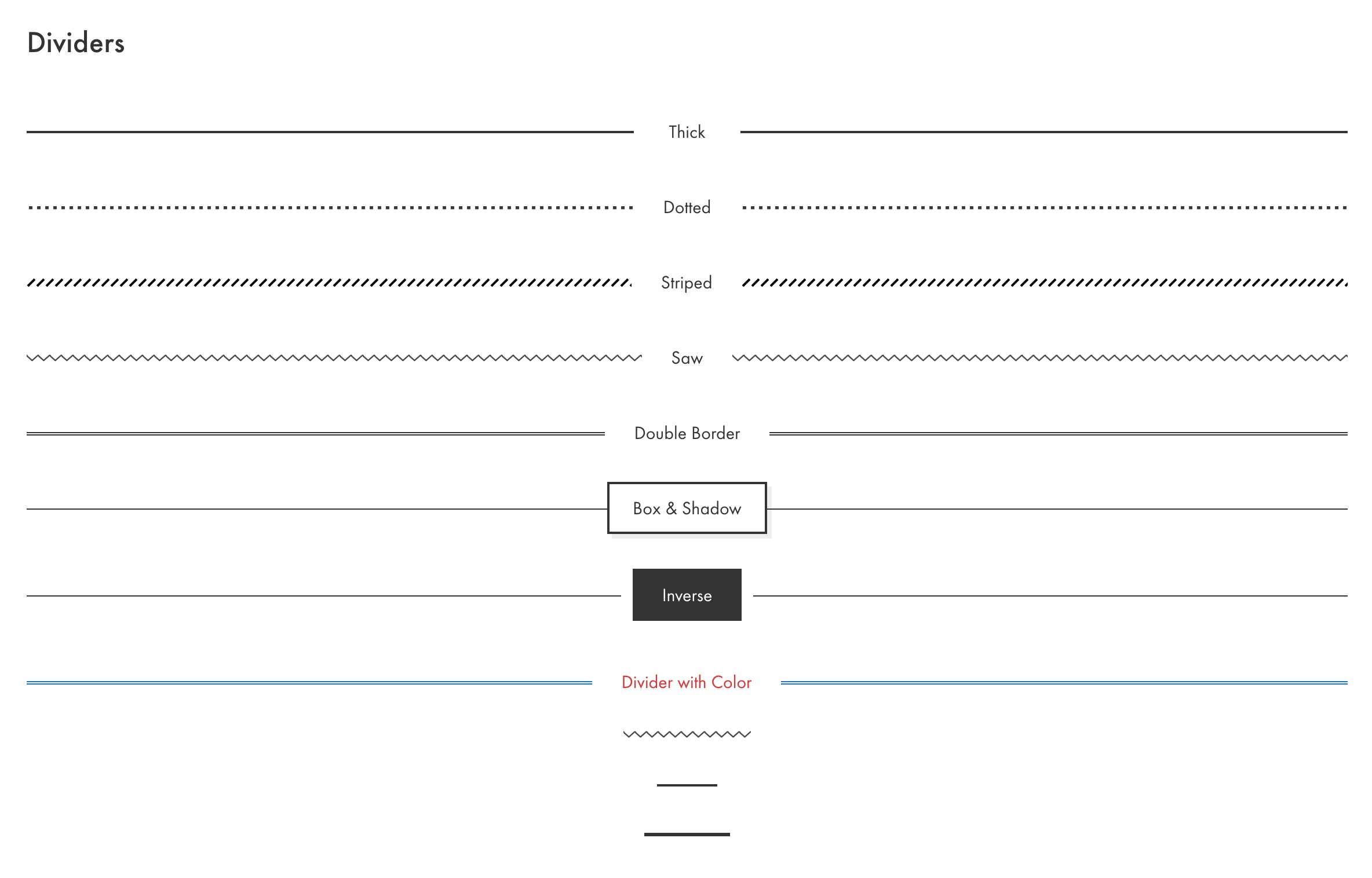
- Divider Style — For the Text Divider type options that will appear are: Thick* , Dotted* , Striped* , Double Border* , Shadowed* , Inverse* and Saw*. And for the Plain type options are: Saw Border**, Thin Dash** and Thick Dash**.
- Width** — Divider width in percentage unit 1-100. Leave empty to use 100 percent as value.
- Title* — Divider title to display in the center.
- Color* — Set custom border color or leave empty to use default.
- Text Color* —Set custom text color or leave empty to use default.
- Extra class name — If you wish to style particular content element differently, then use this field to add a class name and then refer to it in your Custom CSS area. This field appear on every WPBakery Page Builder element.
* Only when Text Divider is selected on the Type area.
** Only when Plain is selected on the Type area.
You can see how each divider style looks on this page.