
 Often you need to tell your website visitors what services you or your company offers. Besides the portfolio, sometimes you want to create a page where you can show those services. On this article we will show you how you can use our Service Box WPBakery Page Builder (formerly Visual Composer) element.
Service Box element
To start using this element please:
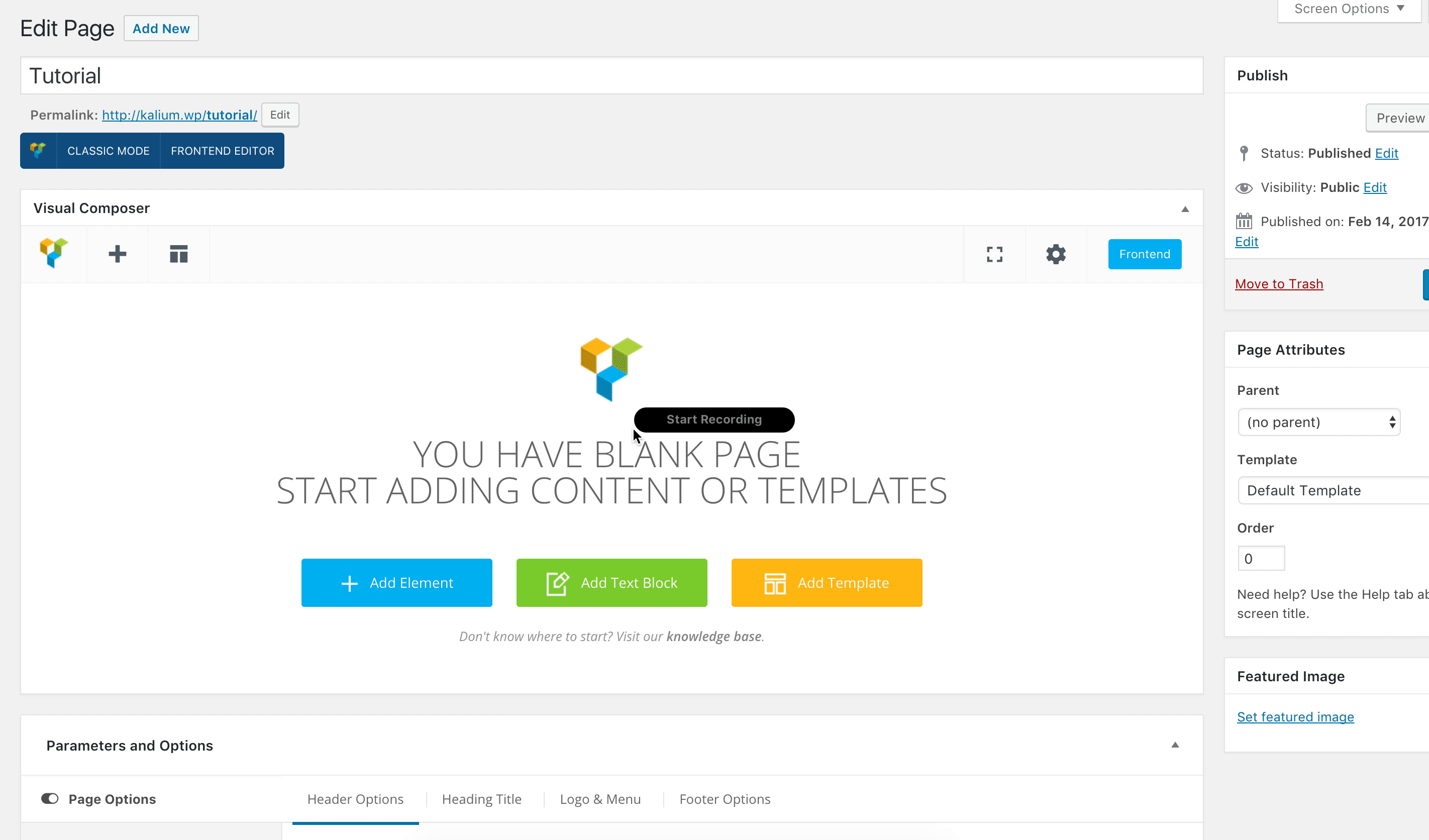
- Make sure that you have clicked Backend Editor button on the WPBakery Page Builder (formerly Visual Composer) area.
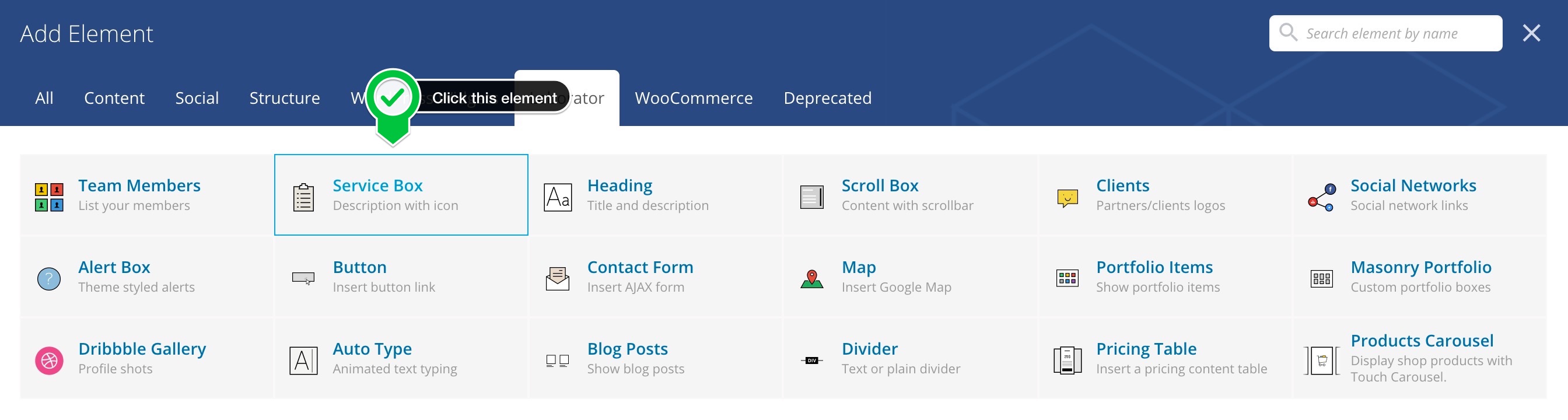
- Click on the Add Element button to continue.
- Then when the Add Elements area appear just click the Laborator tab.
- Choose Service Box element.
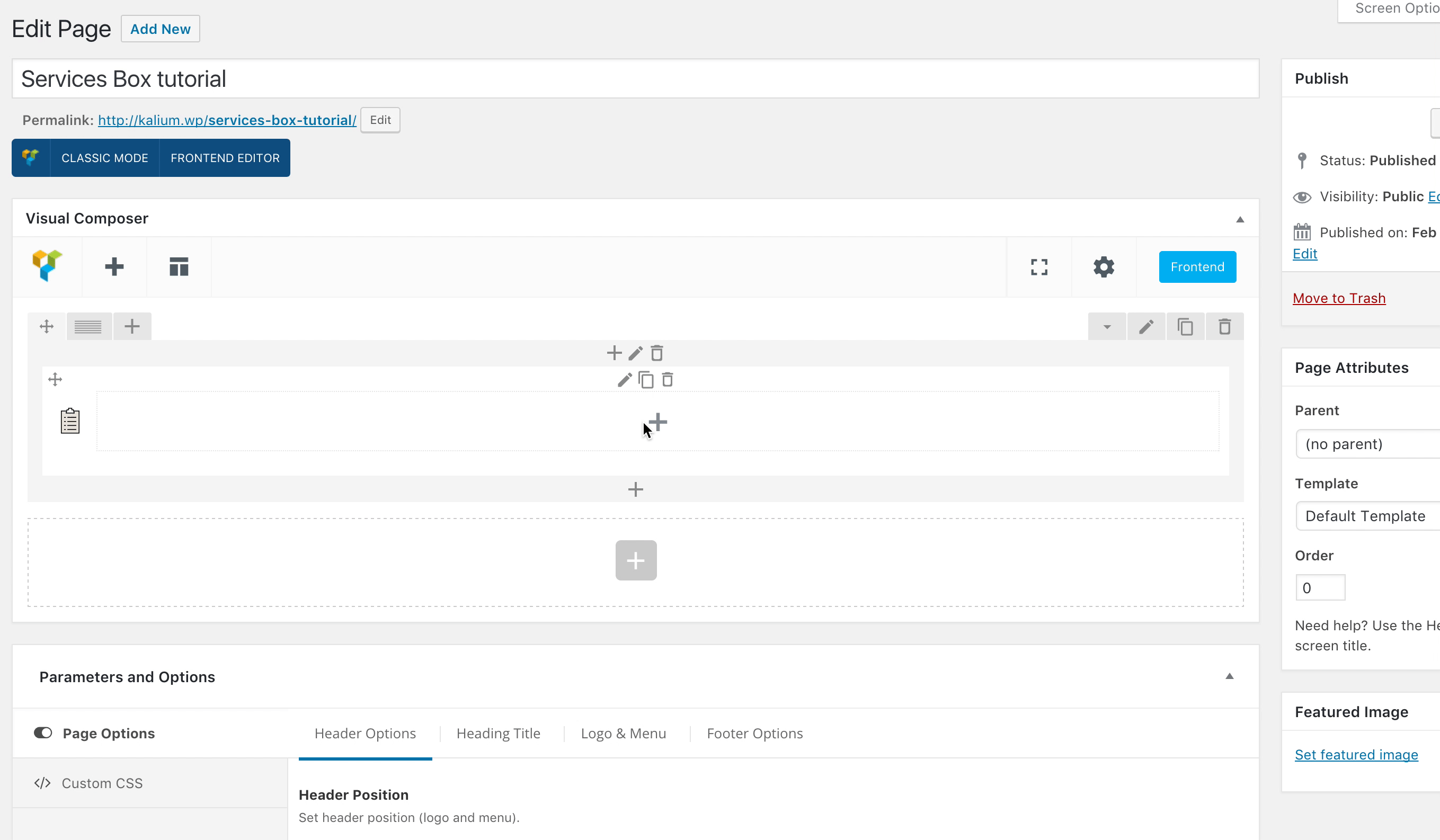
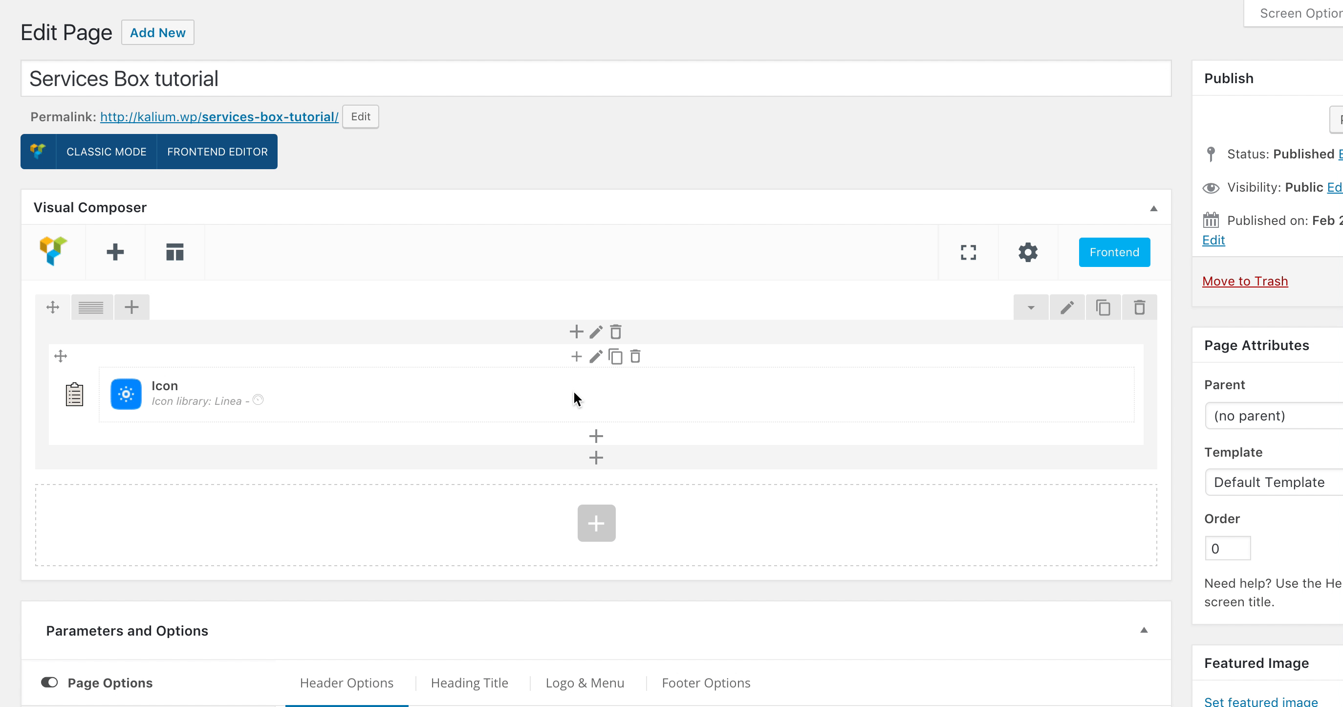
- Then click the + icon on the Service Box area.
You will see two two elements there, the first one is Icon where you can add the icon of your services and the second one is Service Content where you can describe your service. Now we will show you what options those sections have:
Icon
When you click the Icon element Icon Settings area will appear and available options are:
- Icon library — Here you can select the icon library that you want to use. There you can find the most famous libraries, such as: Linea, Font-Awesome, Open-Iconic, Typicons, Entypo, Linecons, Mono Social and Material.
- Icon — Select the Icon from that library that you have selected on the Icon Library.
- Icon color — Select icon color.
- Background shape — Select background shape and style for icon. Available options are: None, Circle, Square, Rounded, Outline Circle, Outline Square and Outline Rounded.
- Size — Select the icon size: Available options are: Mini, Small, Normal, Large and Extra Large.
- Icon alignment —Select icon alignment, left, right or center.
-
URL (Link) — Add a link to that icon. (Optional)
- CSS Animation —Select type of animation for element to be animated when it “enters” the browsers viewport (Works only in modern browsers).
- Extra class name — If you wish to style particular content element differently, then use this field to add a class name and then refer to it in your Custom CSS area. This field appear on every WPBakery Page Builder element.
Service Content
Then you need to click the + sign below your earlier created element. Then click on the Service Content element. When you do that Service Content Settings popup will appear and the options to choose are.
- Title — Title of the widget.
- Description — Description about the service or the item you provide.
- Text Alignment — Select description alignment. Available options: Left, Center or Right.
- Link — Make the title clickable (Optional).
- Extra class name — If you wish to style particular content element differently, then use this field to add a class name and then refer to it in your Custom CSS area. This field appear on every WPBakery Page Builder element.
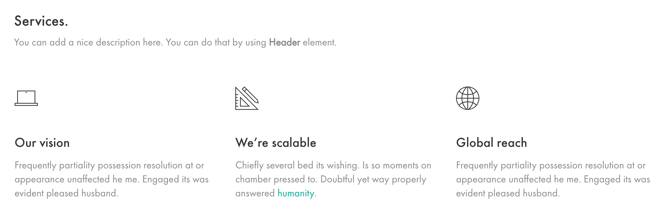
You can see how Services element look on those two links on our demos Services and Services 2 page. There we have used Single Image element to add some images too.