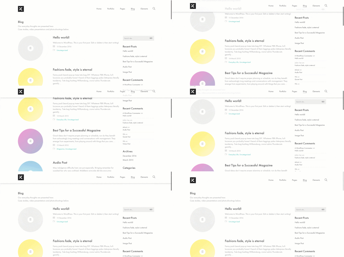
So what’s a sticky header? When a user scrolls down your site the header will remain in view at the top of the screen rather than moving out of view at the top of the screen. The sticky header can help to make it easier for visitors to navigate through a site as they can quickly access the navigation menu rather than having to scroll back to the top of the page.
Enable Sticky Header
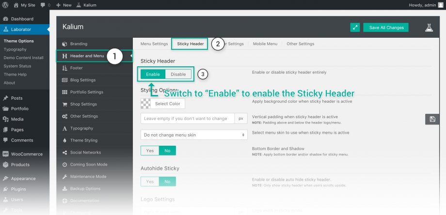
Enabling the sticky header for your site is quite easy, follow these steps:
- Go to Laborator > Theme Options
- Choose Header and Menu from the theme options.
- Select the Sticky Header tab in the top menu.
- Switch the toggle to Enable to get your own sticky header.
Header Styling Options
The sticky header has the styling options independently from the header, you can set styles which will be applied only when the sticky header is active. Let’s take a look what these options are about:
- Header Background — Apply a custom background color that will be applied when the sticky header is active, if not set it will be transparent.
- Vertical Padding — Set the vertical padding when scrolling down your site, usually it is less than the normal one set in Header Settings.
- Select Menu Skin — Select the skin/palette of the menu, you can choose between the default (which can be changed from theme styling), black or white.
Border and Shadow
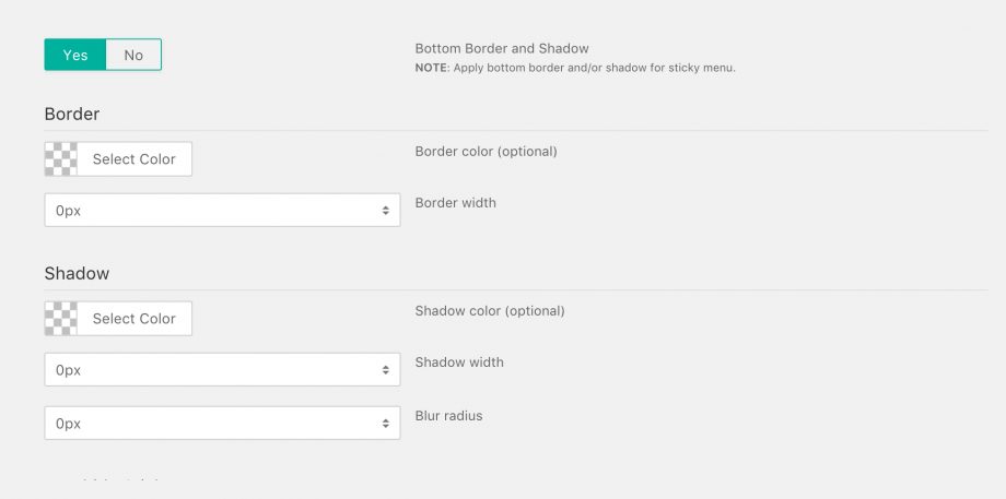
You can set a border and shadow to the sticky header, to enable it in the Bottom Border and Shadow switch the toggle to Yes, these options are optional and only for styling purposes.
- Border Color — Set a color for your border, if you set a width but not the border it won’t be applied and you won’t be able to see any results in your site.
- Border width — Select border width for the header.
- Shadow Color — Color of the shadow you’re about to set.
- Shadow width — Select shadow width for the header.
- Blur radius — Select the blur radius, this will change the softness of the shadow.
Autohide Sticky Header
The autohide option will automatically hide the header while scrolling down, it will show immediately when you scroll a pixel above, it is kind of a smart header we have implemented so it will not block users to see your content and the header will be there.
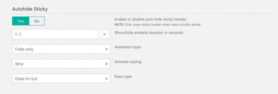
To enable the Autohide sticky header simply switch the toggle to Yes and you will see a interface like this:
- Show/Hide Duration — Timing of the header autohide duration in seconds.
- Animation type — Select any of the animations you want for the sticky header.
- Animate easing — Choose from the animations of the easing type selected below.
- Ease Type — Select the easing type here.
Logo Settings
Branding tools are included too, the logo can be simply resized to a smaller logo by setting the Logo width in sticky mode width when the menu is active, or you can import another logo just for the sticky header, usually shorter variants of logos.
Other Settings
Other important settings for the header are located here, take a look at these options:
- Animate sticky header with scroll duration — Set the sticky header to animate with the mouse scroll at the same time.
- Animate duration in seconds (will show after disabling the option above) — Select the duration of the animation is not linked with the mouse wheel.
- Initial offset — Set after how many pixels scroll you want the sticky header to start showing.
- Animation chaining — Choose the animation chaining on groups, which element should be animated first. Try all of them as they are really fun using and will give impressive results.
Responsive Settings
- Desktop — Enable/disable the header in desktops.
- Tablet — Enable/disable the header in tablets.
- Mobile — Enable/disable the header in mobile phones.


