
|
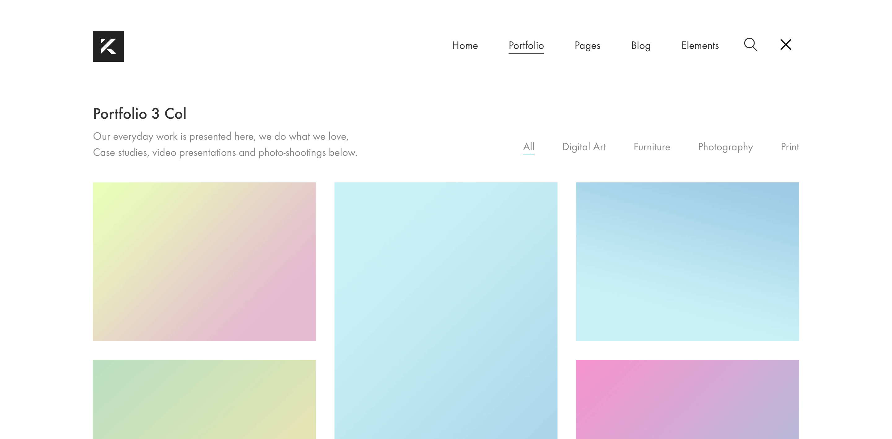
Standard Menu |
Full Background Menu |
|
Top Menu |
Sidebar Menu |
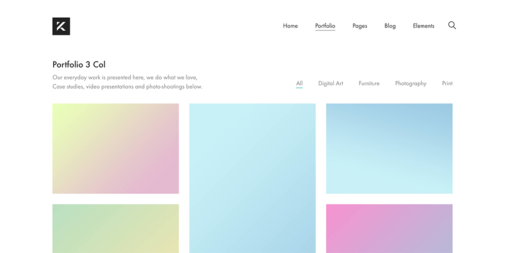

With Kalium you have lots of menu types you can use and by tweaking it a little you can have an unique menu for your own site. There are four types of menu you can choose from, standard, full-background menu, top menu and the sidebar menu and each of them has lots of options separately which can lead to a great menu for your site.
To select one of the menus and set the settings for them, follow these instructions:
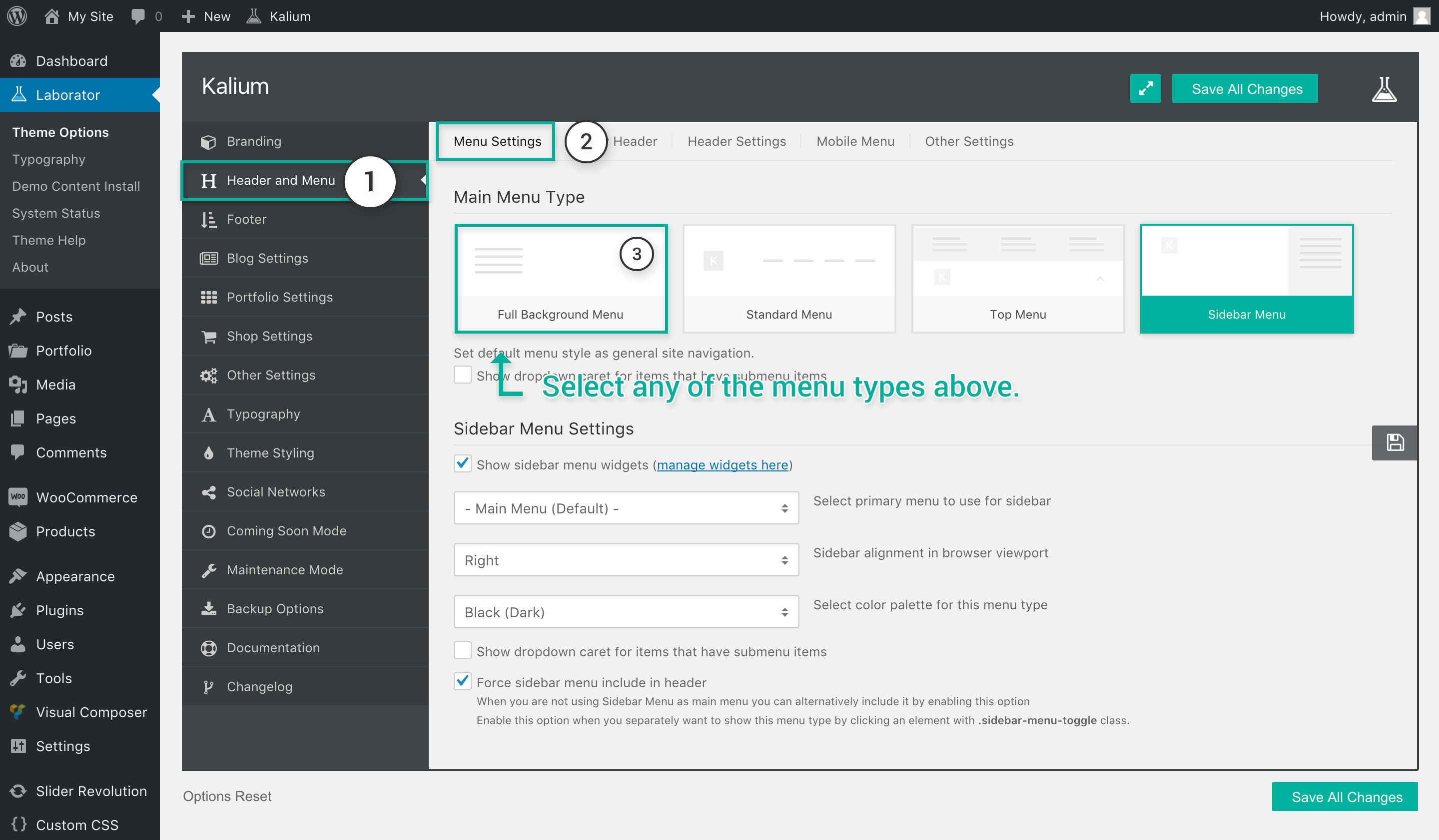
- Go to to Laborator > Theme Options
- Select Header and Menu from the option list.
- Choose Menu Settings in the tabs section.
Standard Menu
- Show menu links only when clicking menu bar — The menu links will show only after clicking the menu bar
 , you can select the animation after.
 - Show dropdown caret for items that have submenu items — Show a caret next to the link that has a sub-menu

- Reveal effect on menu bar click — (this will show only when the first option is clicked) Select any type of animation you want to use when the menu bar is clicked and the menu items will load, they will load one by one.
- Select color palette for this menu type — Select the skin/palette of the menu, you can choose between the default (which can be changed from theme styling), black or white.
 , you can select the animation after.
Full Background Menu
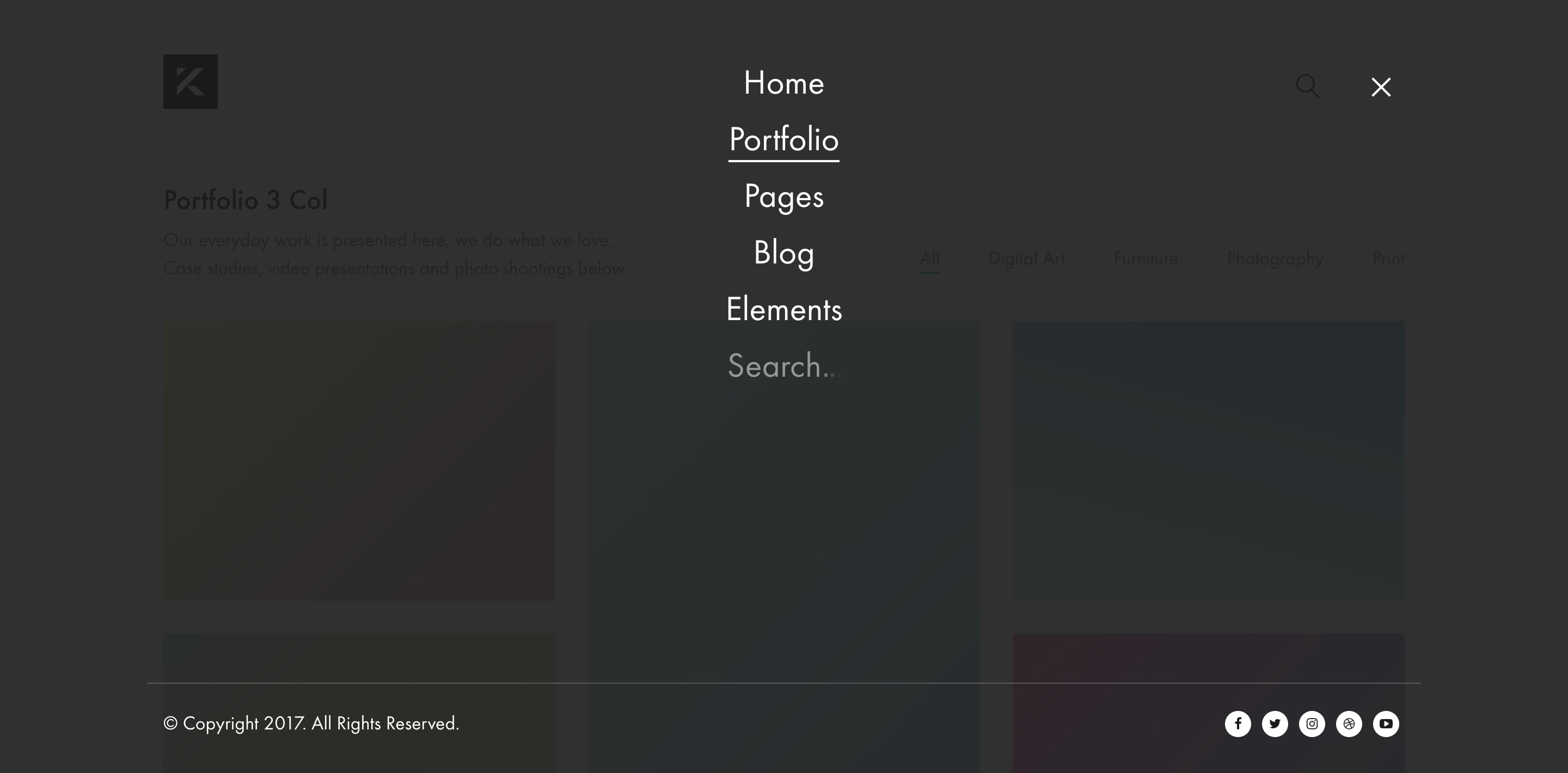
- Search field after the last menu item — Show/hide the search field after the menu.
- Show copyrights and social networks (bottom) — Show a menu footer, where you can add copyrights and social networks just like in the site footer.
- Translucent menu background (apply opacity) — Tick if you want the menu to be transparent and the items elements of the site visible, untick if you want a solid color.
- Menu alignment (when toggled) — Choose the alignment of the full-screen menu by selecting left, centered or centered (horizontal).
- Select color palette for this menu type — Select the skin/palette of the menu, you can choose between the default (which can be changed from theme styling), black or white
- Show dropdown caret for items that have submenu items — Show a caret next to the link that has a sub-menu
Top Menu

- Show top menu widgets — Tick if you want to show extra widgets or not, you will need to add the widgets manually on Appearance > Widgets.
- Center menu items links (first level only) — Tick if you want to center the first level menu items.
- Select menu to use for top menu — Choose which menu you want to use for the top menu.
- Menu items per row (applied to root level only) — Manage how many menu items you want to show in a row.
- Widgets container width — Select the width of a widget container by percentage (Won’t show if you haven’t ticked the first option)
- Set number of widgets per row for top menu — Select whether you want to use 2, 3 or 4 widget columns per row (Won’t show if you haven’t ticked the first option)
- Select color palette for this menu type — Select the skin/palette of the menu, you can choose between the default (which can be changed from theme styling), black or white
- Force top menu include in header — Tick this when you want to use this as a secondary menu besides the default menu.
Sidebar Menu

- Show sidebar menu widgets — Tick if you want to show the widgets, after you’ve ticked this go ahead and add some widgets to your menu sidebar.
- Select primary menu to use for sidebar — Choose the primary menu you want to use there.
- Sidebar alignment in browser viewport — You can set sidebar to left or right, the choice is yours.
- Select color palette for this menu type — Select the skin/palette of the menu, you can choose between the default (which can be changed from theme styling), black or white
- Show dropdown caret for items that have submenu items — Show a caret next to the link that has a sub-menu
- Force sidebar menu include in header — Tick this when you want to use this as a secondary menu besides the default menu.